Nokia Lumia 800
Finally gotten my hands on the Nokia Lumia 800. It looks gorgeous.
Touch
The Metro UI is sleek, and very responsive to touch. In fact, the touch could be described as too sensitive - it often mistaken my “mousedown” (if I may call it that) for a “tap” (as if I’d let go). This isn’t as big a problem in the normal menu navigation; when in the browser I’ll accidentally trigger zoom in/out surprisingly often. Perhaps it is a MSIE thing.
In any case, it is not laggy.
[6 days in] The gesture misreads is getting rather irritating. Reading and scrolling a webpage very often trigger the zooms or even unintended click on links YMMV, but I don’t even think about the worrying about such accidents on iOS; Perhaps they err on the side of less destructive gesture or something smart. Regardless, my experience is that even the original iPhone interprets gestures generations ahead of Lumia 800.
[Update] This informative video of Microsoft explaining how touch hardware needs to “meet specifications” actually speaks volumes of the great amount of attention Apple has put in since the first iPhone. The touch experience on the 2007 iPhone is still unsurpassed in 2012, think about that.
(Can’t shake off the feeling that the video is an irresponsible (we did our part) & pre-emptive disclaimer of “their hardware is at fault, don’t blame us”)
There is also inconsistent treatment of “mousedown” style on links. e.g. In Google Mail tile, the links are helpfully highlighted when “mousedown” - like on iOS. Whereas in People tile, reading a tweet and clicking on a url is tricky - the whole tweet gets a “3d mousedown” treatment (like tapping a wooden plank floating on water) and only when you release then do you find out if you’ve tapped the link or done nothing useful.
Readability
[6 days in] Metro, a typography-based design, renders itself (home, menu, native apps) very well. I’ve initially commented to my wife that the fonts look sharp & I didn’t even miss the “retina display” (unlike when I look at older iPhones).
Sadly, the same cannot be said for webpages in the browser - where fonts tend to be smaller. Text look ugly there.
[1 month in] The Metro layout allocates a lot of space on boasting its own sense of style (which looks gorgeous to demo, e.g. the big screenshot above content only shows after ~40% of the screen, and the right 10% is “spent” on revealing the next screen). This might be fine for a desktop or tablet, but starts getting pointless on the small screen after extended usage. A survey of some apps in their app store (e.g. Facebook app), seems like when following Metro look and feel, it is very easy to fall into the trap of only using half the screen for content.
Web Browsing
[6 days in] On Mobile Safari, if the web page doesn’t render well I’ll [double-tap] zoom & scroll as I read, or I’ll tap “Safari Reader”, if that still doesn’t work I’ll tap my Instapaper bookmarklet & read it later on my Instapaper app. On the Lumia, due to touch gesture issues, the “zoom & scroll” route has 50% chance of taking me through an article. If that doesn’t work, then there’s no redress: No readability feature, no Instapaper app (unless I pay monthly subscription).
The net effect is, I’ve caught myself dreading to visit a link, go search for something on the web or generally using the browser. This is quite unlike the general sentiment of web browsing on the iOS.
Transitions
Stark changes to rectangular areas on the screen is often confusing. When tastefully used, subtle animation can help explain to a user where something came from or went (e.g. [dis]appearance of dialog boxes).
In Metro, pages often peek at you from beyond the screen edge, elements at the top/bottom bounces around, and things in the middle often swirl & flip themselves silly, tapping on buttons sometimes give you that a slight vibrating buzz (a poor attempt at tactile feedback).
(Regarding the part where pages peek: unfortunately Metro chose to wrap you around as you swipe toward the page on the right, instead of ending on the “last page”. Thus making it lose all the spatial benefit of having a view port in a big space metaphor)
Though much better than Vista days, I continue to get the feeling that Microsoft interfaces enjoy telling the user, ”Hey, look at ME!” more than removing distractions from the task at hand or leaving limelight for the user’s content.
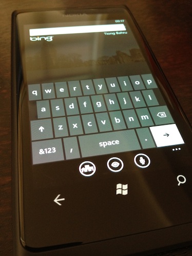
A case in point is the hardware “search” button. When you want to search for something on the web, e.g. “metro ui”, tap and it will bring up Bing.
The beautiful background photo is sprinkled with tiny animated boxes - if you tap on them, will show you a trivia of some sort. This eye candy obviously speaks well of whoever had put it together, “Look at our new search page, mum!”. However, the task at hand is to search - not marvel at the search page. A better flow would be to bring up the keyboard for the user to immediately type whatever he’d want to search for before he’d forgotten it (which is “metro ui” in the previous paragraph).
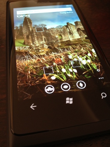
To make it worse, the search button is located below the bottom of the screen, whereas the obvious next step is to tap something at the top of the screen.
What’s nice though, is their sidestep of Apple’s rubber band (bounce scrolling) patent. This might have changed, but I recall Android to have a lame, abrupt halt when a scrolling window reaches the end. Metro, however, implements an equally effective [to Apple’s rubber band] effect by squeezing the height of elements into the edge of the scroll window, like passengers pressing onto each other (and bouncing back) when the train screeches to a sudden stop.
Sleep/Wake
How do you pick up your phone from your desk? Go ahead and try it. Not something I’m conscious of before this, but I pick it up by the sides. Unfortunately this means I’ll often accidentally hit the sleep/wake button on the Lumia 800 - that button is smack in the middle on the right side. A reference for iPhone 4 users, the equivalent would be having that button just above your sim card slot. Yea, go figure. What’s wrong with having the sleep wake button on the top edge? Was that patented as well?
Hardware Back Button
[6 days in] The issue with a hardware back button is the lack of a hardware forward button (when combined with the fact that websites just love redirecting you to their mobile version).
For example,
Tap on People tile > Read news feed > Tap on tweet > Tap on url in tweet > Loading link > Redirected to mobile version > Page loads
After reading, you tap back to Tweet screen to reply that tweet, but you see Loading link > Redirected to mobile version > Damn, you tap twice but the redirect was faster than you, you’re still at mobile tweet page, then you tap faster, tap.. You’ve tapped too many times and you’re back at news feed screen (or worse: home screen).
Without an equivalent forward button, it is onerous to get back to the correct place to reply that tweet (how far did you scroll?). Especially since re-entering some of these screens will refresh and thus change positions of items in lists. At this time, it begins to feel like a chore.
[3 weeks in] To make things worse, the “Home button” on WP7 does not bring you back to the Home screen. Instead, it launches the Home screen app on top of your current app. This is a subtle, but important difference to where you thought the “Back” button will bring you.
On more than one occasion, tapping the “Back” button had unexpectedly brought me past the Home screen and [back] into a screen that I’d forgotten about, lost for a moment, and not sure what I’m supposed to do since the screen is totally irrelevant now.
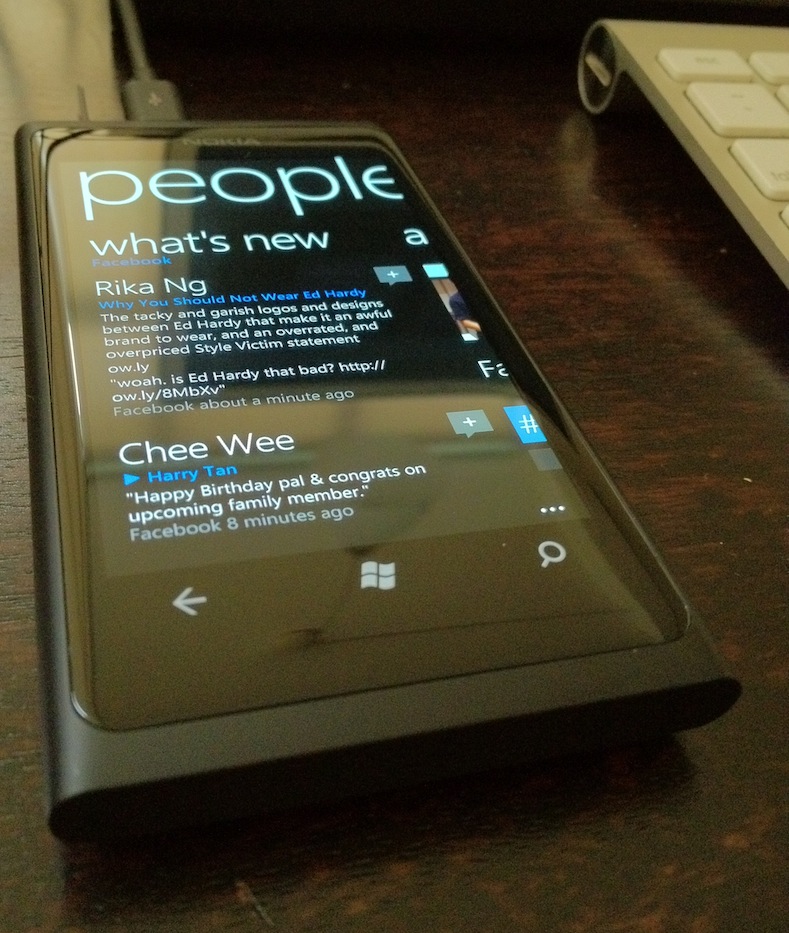
I like the “People” tile. If you’re willing to let Microsoft in to your world of Facebook, Twitter & Google, you’ll basically get a Flipboard phone. Their [addressbook] integration extends into the “Calendar” and “Pictures” tile. Tweeted pictures, Facebook photos shared to you will all show up promptly neatly organized into albums.
I don’t actually have the urge to download a Twitter or Facebook client for this phone. Yet.
It would’ve been even better if the randomly chosen background photo (in Pictures app) could get some just-in-time blur / contrast treatment applied (like Path). Currently, the slim, white text can be a tad difficult to read.
[6 days in] I’m finding the People tile integration / presentation of Facebook newsfeed (which impressed me earlier) to be shallow - messages spammed by friends playing games appears unfiltered, listing purely by recency isn’t as interesting as how Facebook interleave activity, uselessly small thumbnails are also tiring to look through. As a result, I’ve been looking at far less shared videos… which could be a good thing.
Camera
Scenes: auto, backlight, beach, candlelight… White Balance: auto, incandescent, cloudy… Exposure Value: -0.5, 0, 0.5, 1.0… ISO: auto, 100, 200… Metering Mode: Centre Weighted, Frame Average, Centre Spot… Effects: Normal, Black & White, Sepia…
Settings that reads like an actual point & shoot camera. I hate it.
Also, having Press the screen to take pictures = On as default is sure to trip up migrants from iPhone. But maybe they are only trying to poach adopters from the market size leader.
Computer
The phone told me there was software update available, instructing me to “connect to a computer”. Obviously, that simplistic instruction wouldn’t work on my mac. After a bit of googling, I concluded that I need to install “zune” on my mac - which brings me to this page.
The download is a .txt file. Inside the file, is the instruction to go to another URL (itunes.apple.com) to download the app. WTF? Instructions inside a text file? Did they steal that awesome user experience from some random bittorrent site? Where’s my ascii art?
FWIW, Paypal is worse for doing such 302 Redirect with a PDF file.
Copy Paste
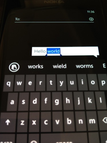
[3 weeks in] You tap on a word and the copy-paste icon immediate jumps up. Tapping on the icon will prepend the icon into the list of auto-complete words. Now, whenever the keyboard shows up, the [paste] icon is there, ready for you to tap and paste into the text field. I find this reuse of the existing auto-complete mechanism very elegant.
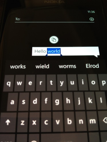
After pasting once, the icon goes into partial hiding into the left of the screen. Tapping on it will reveal it in full, and tapping it again will paste the content into the text field (and the icon goes into partial hiding again). I find this dance slightly unnecessary, since it doesn’t save a lot of pixels. Moreover, you can “throw” the icon left and it will completely disappear from the autocomplete list and save even more space (only to re-appear when focusing on a new text field)
Also unfortunate, is if you turn off the screen (easily by accident, as mentioned earlier), the clipboard is completely deleted. This is either due to security concerns, or (more likely) due to the need to have a way of free-ing up the autocomplete screen space.
End
The OS appeals to me and I attribute all hiccups encountered to the relative youth of the platform. I’m hoping to use it, at least for the next few weeks, as my full-time phone.
But I sure miss Instagram already.
[6 days in] Though I paid for my iOS Instapaper app, I’m not a paid subscriber for Instapaper, thus no Instapaper app for me; I’m very much missing the relatively new (and relatively minor) feature on iOS: Safari Reader.
[1 month in] I’ve sold it.